A landing page is not judged on its design. It is judged on what a visitor arriving from an advert, on a phone, understands in three seconds.
The first screen
It contains four elements, and nothing else.
What it is, said in one sentence understandable by somebody who has never heard of the brand.
The price, or how it is made up. Hiding it makes half the visitors leave.
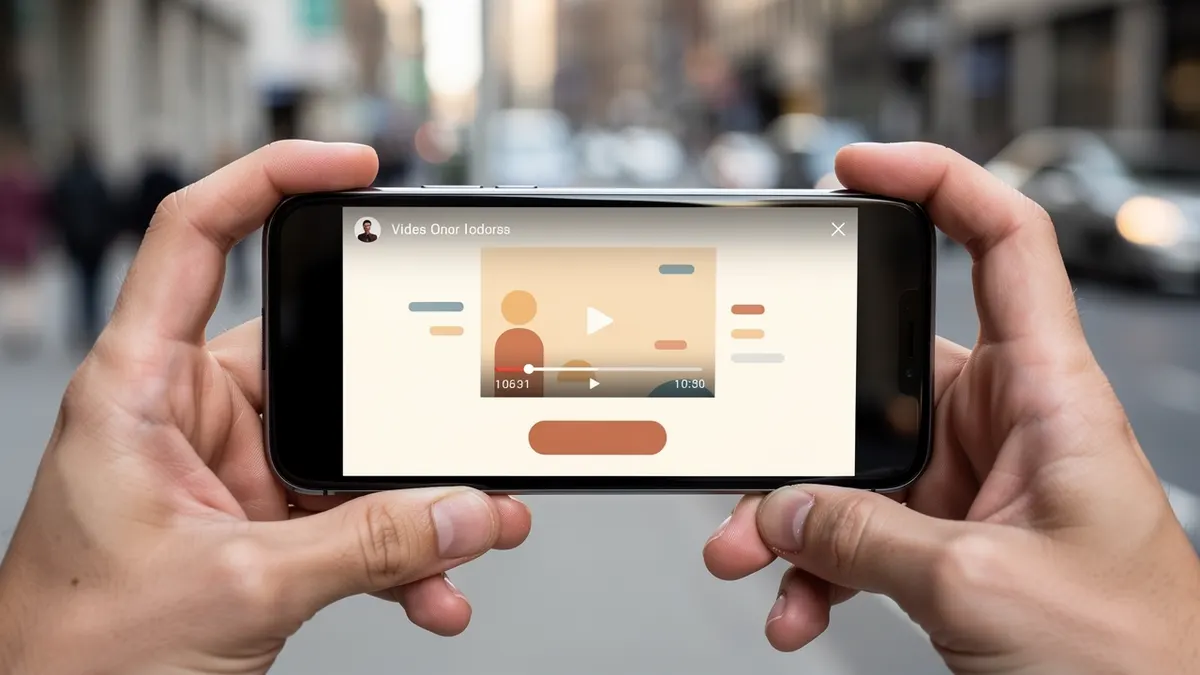
The video, with a cover image showing the product in use and not a logo.
And the main action, described in the box.
Everything not serving those four elements moves further down: the brand's story, the values, the mood photographs.
The video must answer the advert
That is the first cause of loss, and it is invisible in the statistics.
Somebody clicks on an advert promising something precise. If the page talks about something else, or if the video starts with a general introduction, the promise is broken and the visitor leaves.
The practical rule: the page's video repeats, in its first three seconds, the image and the words of the advert that brought the visitor. Sometimes it is the same video, cut shorter.
Add a production consequence: if the brand runs five different adverts, it needs five versions of the page, or at least five video openings.
Sound
It is handled the opposite way to what people think.
The video starts without sound, in a short loop, with legible subtitles. A visitor who wants sound turns it on themselves.
Two frequent mistakes: the video starting with sound, which closes the tab in a second, and the video with no subtitles, which makes the message inaccessible to most visitors.
Add a long version further down the page, for those still hesitating. It will be watched by few people, and those few buy.
The expected trust signals
Five elements, and they count more than the design.
Reviews, with real faces or names rather than anonymous stars.
The payment methods accepted, displayed clearly.
The real delivery times, by area.
The returns and exchange policy.
And proof of existence: an address, a number, a company name.
That information reassures all the more for being precise. An honest delivery range beats a round promise.
What the video changes depending on where it sits
| Placement | Role | Useful length |
|---|---|---|
| At the top, before the price | Make the product understood | 15 s |
| Mid-page, near the reviews | Lift one precise doubt | 25 s |
| At the bottom, before the button | Reassure about delivery | 10 s |
What is prepared so the page stays fast
A compressed file, a sharp cover image, playback that does not start on its own and subtitles readable without sound.
What is measured after going live
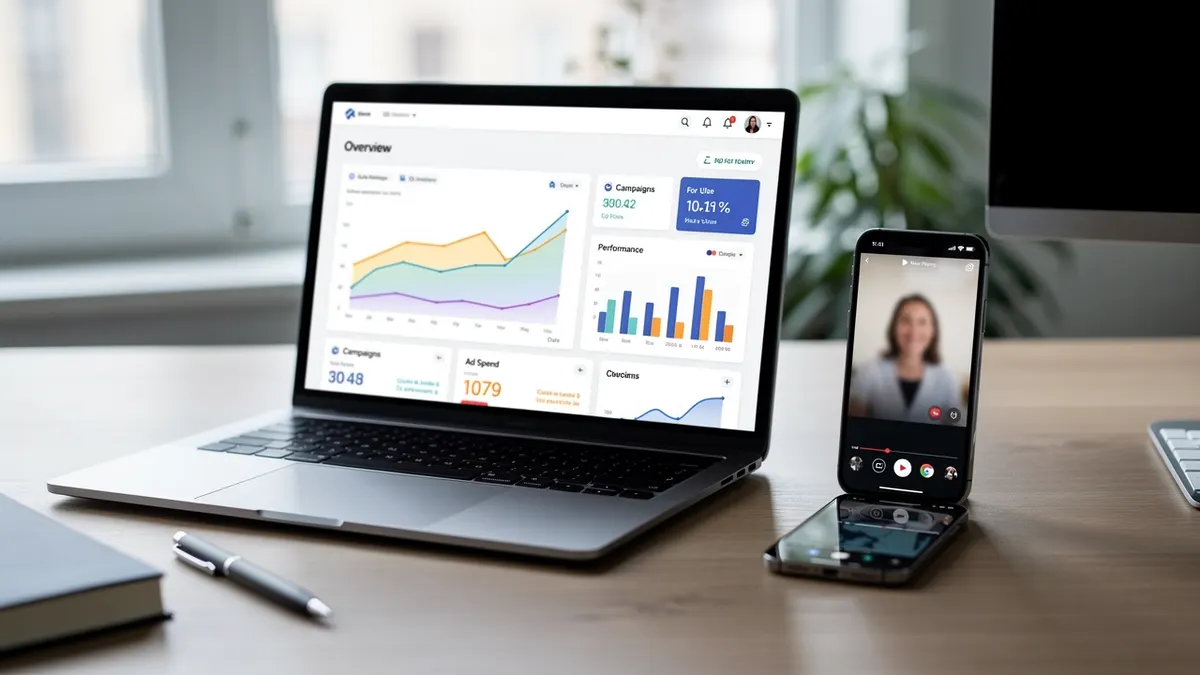
Time spent on the page, the share of visitors who start the video and the add-to-cart rate: that is the only way to know which one to keep.
What to measure
Three figures, and only one is decisive.
The loading time, measured on an ordinary mobile connection and not on the office one.
The share of visitors who reach the main button.
And the number of opened conversations that end in a sale.
That last figure is the only one that really counts, because it measures the page, the video and the team's response at once. A perfect page opening conversations with no answer sells nothing.