A media kit is not a presentation of you. It is a commercial document whose only purpose is to make the decision easy, and the order of the blocks decides everything.
One page only
Beyond that, it is not read to the end.
A buyer opens the document on a phone, between two meetings, and gives it less than a minute. Everything that does not fit in that screen has to disappear, not be shrunk to seven point.
One page, five blocks, and a link to the examples. That constraint is what makes the document useful.
What it contains
Five blocks, in this exact order.
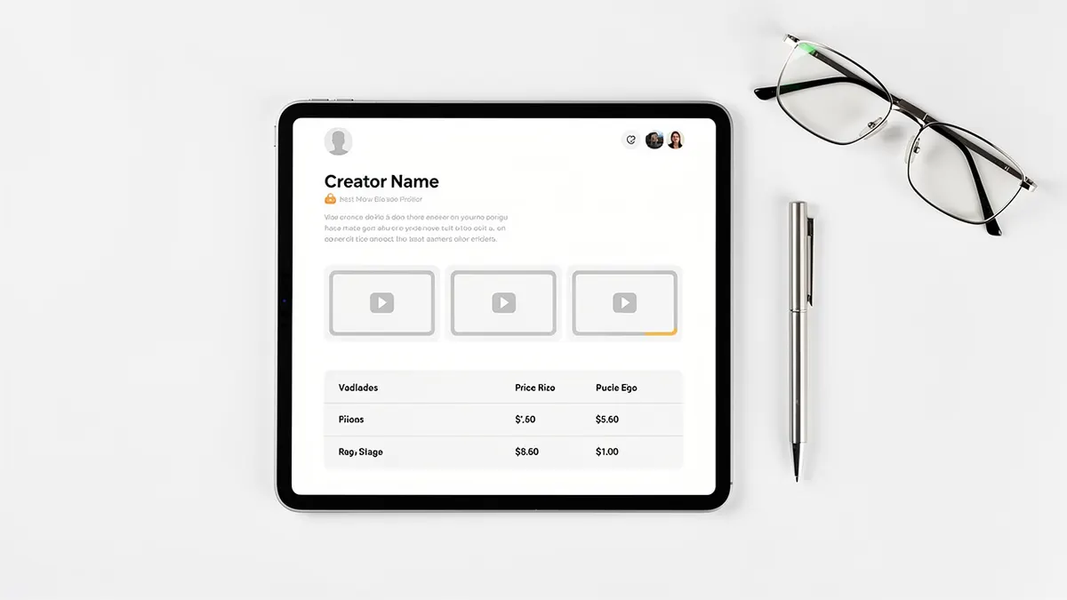
What you film, as one precise category and not as a list of skills. Three examples, clickable, that play without signing up. What the client receives: number of videos, formats, openings, subtitles, source file. Your usual timescales in working days. And your rates, with usage rights priced separately.
Add a dated availability line, changed every month. That is the detail that separates an active profile from an abandoned one.
Why showing your prices speeds everything up
It is frightening, and it works.
A buyer who does not know your price postpones the decision, because it means writing, waiting, comparing. A buyer who knows it decides within the minute, and those who leave are the ones who had no budget anyway.
So show a range per deliverable, say what makes it vary, and state clearly that usage rights are a separate line. You lose the unrealistic enquiries and you save time on all the others.
In this market one extra clarification is useful: say whether your prices exclude tax, since that is the basis a business client thinks in. The statements applicable to your quotes and invoices depend on your status and are checked with the competent administration and with an accountant.
What to remove
Four things, without exception.
Your personal background, which interests nobody at this stage. Logos of brands you have not worked with, including as inspiration. Skills listed with no matching example. And screenshots of statistics, which date the document and suggest you are selling an audience.
The practical format
Three technical rules that avoid half the non-replies.
A document that opens without a heavy download and reads on a phone. Links that work with no account and no password. And a small file size, because a file that is too heavy, sent through a corporate mail system, sometimes never arrives.
Keep a Spanish version and an English version, written by hand, with the same five blocks.
What a kit that works contains
| Page | Content | Weight |
|---|---|---|
| 1 | Three samples and the city | The heaviest |
| 2 | Formats, languages, lead time | Medium |
| 3 | Range and terms | Light |
What has no place in it
A moodboard, a wall of logos with no campaign behind them, unreadable screenshots of statistics.
What is updated before each send
The lead sample, this week's availability and the price of the requested format.
Update it every three months
That is the part nobody does, and it pays.
Replace the weakest of the three examples with the most recent job, change the availability line, and check that the first example still matches the work you want to receive.
That last point is not cosmetic: it determines the nature of the enquiries you will get the following quarter.